There’s plenty of buzz around about data, visualisation, and how we can best make use of it in the classroom. David McCandless demonstrates it better than most in his TED Talk “The Beauty of Data Visualisation.”
That’s all well and good, but that data’s not always the easiest thing to get hold of in a form that’s raw enough to turn into something accurate and powerful, and actually processing it is something with a huge margin for error and often needs a command of some relatively hefty tools.
Until now. Meet Gapminder and HowBigReally?.
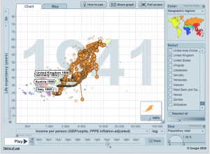
 Gapminder provides access to real world quantitative data in a way that allows you to compare & visualise statistics across the globe and over time. Want to show your students the costs of both world wars in terms of economics and human life? Simply put “life expectancy” on the vertical axis, “income per person” on the horizontal, select a few countries in Europe from the list on the right, and press Play. Gapminder will animate and track the relationship between the two statistics over time. The discussion & unpacking the story that data tells is where you and your students come in.
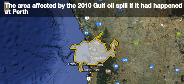
 HowBigReally is a resource published by the BBC to provide a spatial visualisation of world events in comparison to a local map. It looks like a fantastic way to bring a global perspective to our students on their place in the world.


Leave A Comment